Meet the new Sourcegraph UI
Sourcegraph has grown rapidly in the last few years. We've made code search an indispensable tool at some of the world’s best-known companies. We've launched new features such as Code Monitoring and Batch Changes, fixed hundreds of bugs, introduced powerful new search capabilities, and many, many other features.
In the midst of all of this growth, we found that users were experiencing difficulties caused by our aging visual design language and that the design of major components was limiting our ability to advance Sourcegraph as a product.
As we attempted to modify and extend our design system to adjust to these challenges, it became clear that our current UI was not going to be able to support the next few years of Sourcegraph's product journey.
So with our users and the future in mind, we dove deep into Figma and Excalidraw and sketched concepts in notebooks and maybe on the odd napkin. We presented and reviewed and tested and refined. We searched Sourcegraph thousands of times to discover the scope of impending changes, review code, and answer questions like, "How often is border-color-1 used" or "Who altered this component last?" We created issues, wrote code, read code, deleted code, and merged changesets.
And now, today––a few short months after beginning the project––we are proud to bring you an entirely new visual design for the Sourcegraph UI. Let's take a look at some of the new designs and how they will help users find references, troubleshoot errors, gain insight, make changes on a massive scale, and read code.
Refined search results design
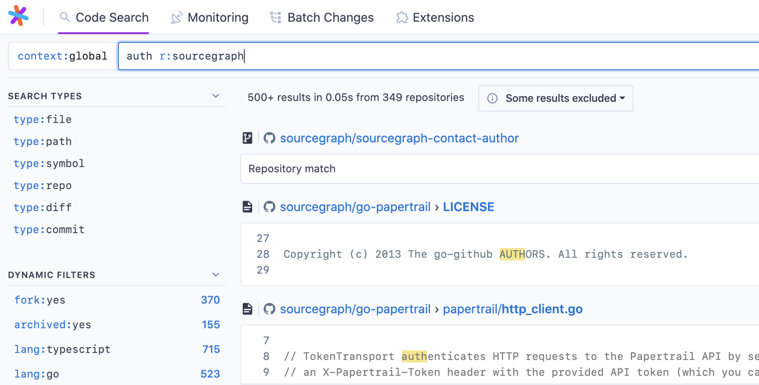
- Searching code can require writing code. The redesigned search bar is 100% width at all times to provide the space required to be expressive with queries.
- We want to reduce the requirement to learn query syntax. The new results sidebar provides a home for features like dynamic filters that help users discover search syntax without referencing documentation. It also provides room for new features, so watch this space.
Renewed focus on code
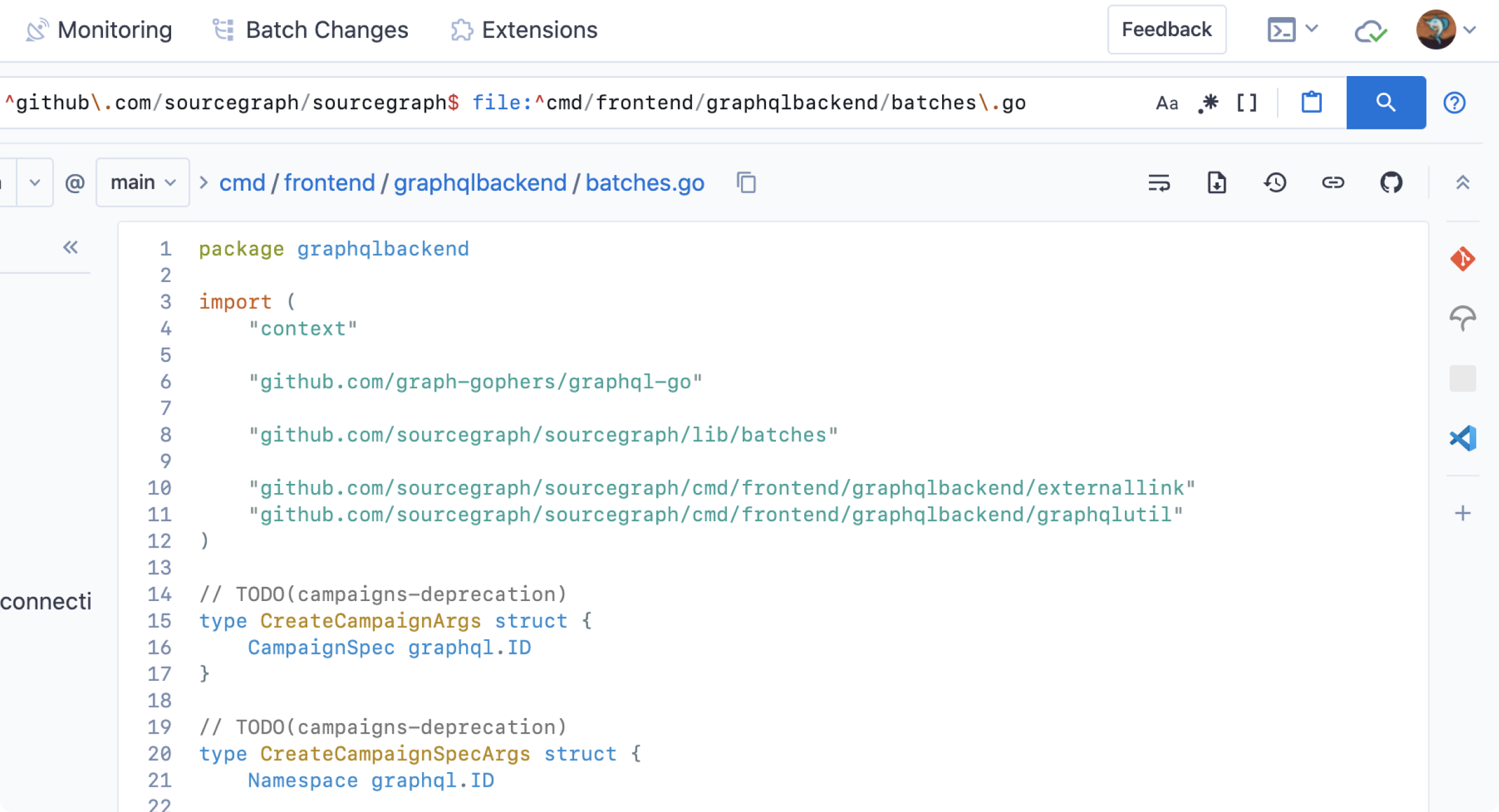
- Readability of code is paramount. To facilitate that, we’ve reduced non-essential UI elements to provide greater focus on the code itself.
- Complicated interfaces can cause fatigue, so we've reduced UI elements overall and positioned the most important items so they’re unobtrusive and live exactly where they are needed.
Improved layouts
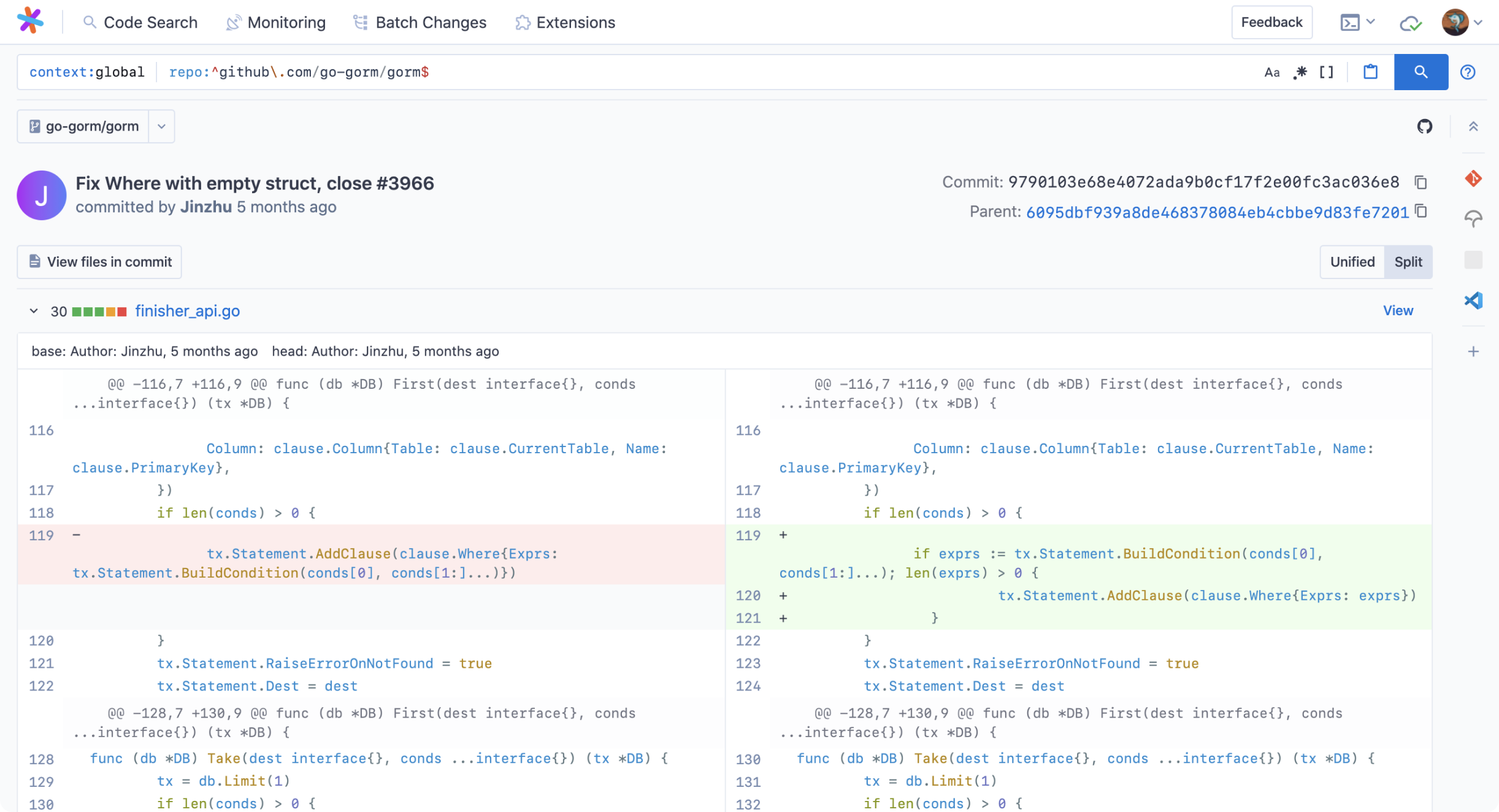
- Layout factors heavily in the usability of a design. We've improved pages like diff views to make them easier to use and to help users quickly find the information they need.
- Segmentation improves focus. We've neatly wrapped sections of the UI in containers to help users focus on the most important elements.
Consistent headers and navigation
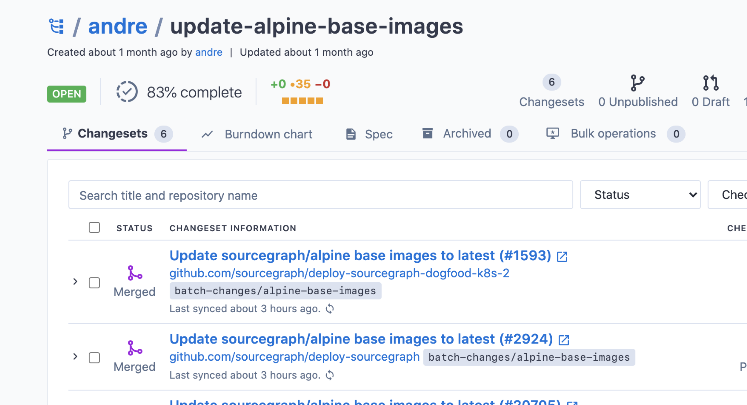
- Sourcegraph is rapidly becoming more than code search. A new global navigation provides immediate discoverability and access to current and future functionality.
- Consistency improves usability. We've standardized headers to orient users and provide all available options in a single location.
Promoting extensibility
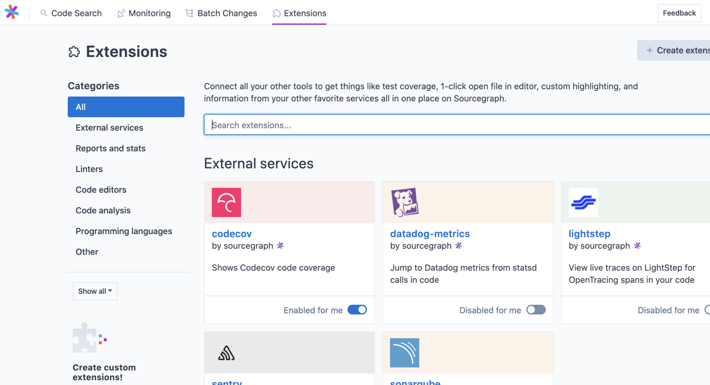
Everything you know about your code can live in one place. We've brought the extension registry back to the main navigation and improved its design and navigation to help you find addons that merge your data, other tools, and code into a single pane of view... and to promote extensions you've built.
Try it for yourself
These are some of the highlights, but we invite you to try it for yourself at sourcegraph.com/search. We think you'll find this new design improves your experience and sets the stage for some incredible features to come.
The new Sourcegraph UI will ship to on-premise and enterprise customers in version 3.29.